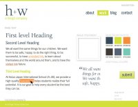
This site came about through a lot of thought & hard work. But it would not have ‘become’ without a lot of inspiration, community & great online tools. This is our way of saying thank you & providing a glimpse into the design process & tools that made it happen.
Design
We did our best to take our own medicine, and did a fairly thorough job of discovery on ourselves. We wrote down our goals, researched lots of sites we liked (and some we did not), mapped out the site and worked on some style tiles (thanks Samantha!). In developing our identity we went through a number of different typefaces and eventually settled on ITC Berkeley Oldstyle Pro and Trade Gothic for our logo. We used Berkeley for H1’s, paragraph intros and pull-quotes, and Trade Gothic Light for body copy and Condensed for 2nd-level and lower headers. We did a bunch of initial experiments using Typecast and then used Skyfonts to shift into Illustrator for working on style tiles. For the live site we’re using Fonts.com. For just a little more panache, we’ve added the icon font set Font Awesome. It’s really easy to use, and we’ve had very good luck with it.
Because it’s what we believe is the right way to make sites, we’ve designed it from the very start as a mobile-first, HTML5/CSS3 responsive site, and have tested it quite a bit on a variety of phones and tablets. That’s always a work in progress but we’re pretty pleased so far.
Build
The site is built in Drupal 7 with a theme developed by Jason from the ground up using HTML5, CSS3 and a liberal sprinkling of HTML5 Boilerplate, Modernizr, Selectivizr and SCSS/Compass. We’ve also made good use of John Albin’s Zen Grids to help get things lined up and flowing the way we’d like.
Inspired
This wouldn’t be complete without mentioning some of the designers and sites that inspired us. Much thanks for the amazing inspiration and typography of Daniel Mall, the beautiful layout on Liz Danzico’s site, Dan Cedarholm’s newly redesigned SimpleBits, A List Apart, and Built by Buffalo’s combination of elegant layout and smart stats. We know design is a high percentage of perspiration, but it always helps to have a health dose of inspiration too.

